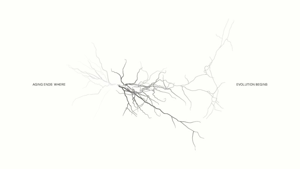
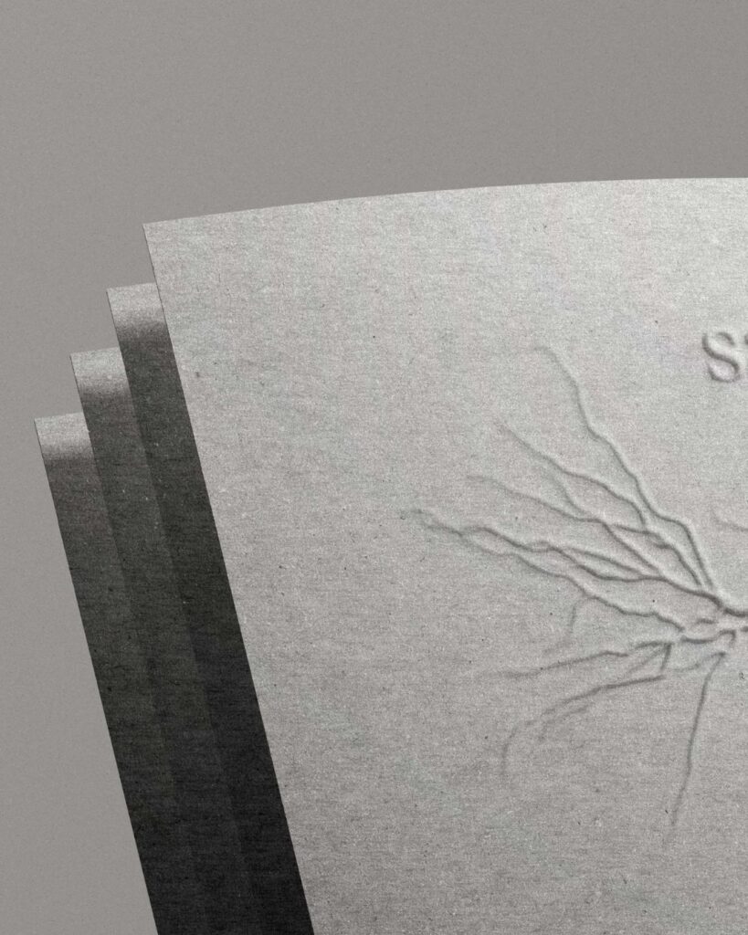
SAPIOHUMANS operates at the intersection of cognitive science, biological aesthetics, and post-human philosophy. The brand challenges traditional notions of aging, promoting the idea that “where aging ends, evolution begins.” It’s crafted for an audience that values intelligence, regeneration, and the balance between body and mind.
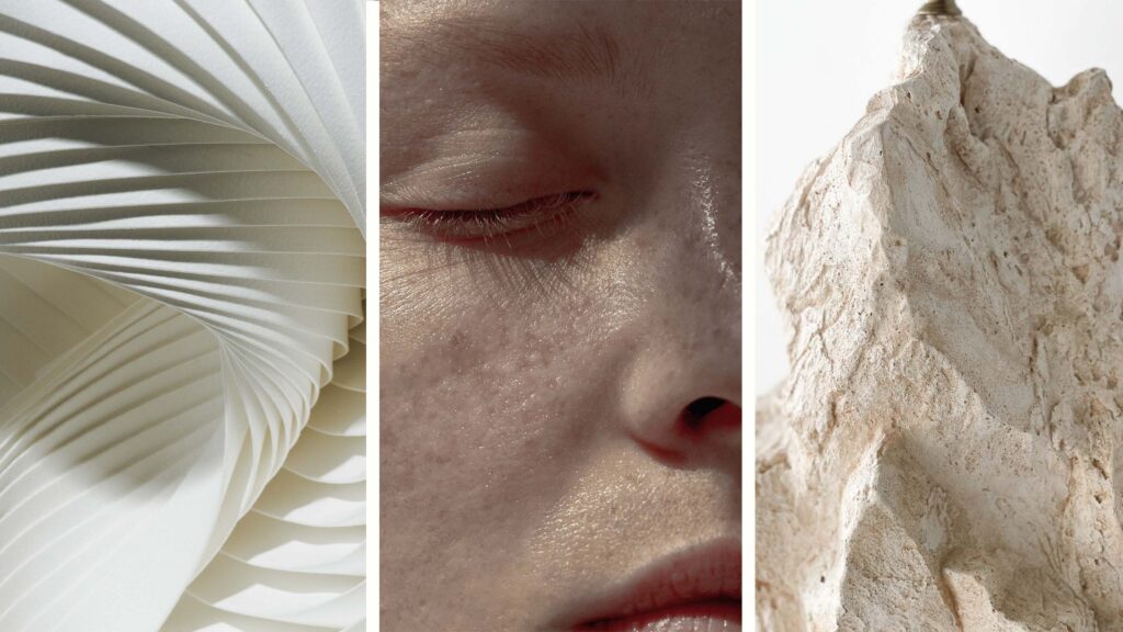
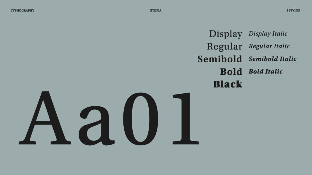
The objective was to create a refined, symbolically rich visual identity that captures the essence of the brand such as cognitive vitality, biological elegance, post-human aesthetics and regeneration.
The identity needed to be timeless, concept-driven, and function seamlessly across digital and physical brand touchpoints.
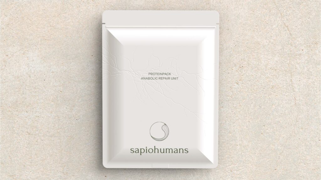
Rarely used raw, cork brings both innovation and cultural relevance. In Portugal, it’s more than a material, its heritage. This design honours that legacy while serving its purpose by carrying food from the earth and linking local identity to global sustainability.
CREATIVE DIRECTION
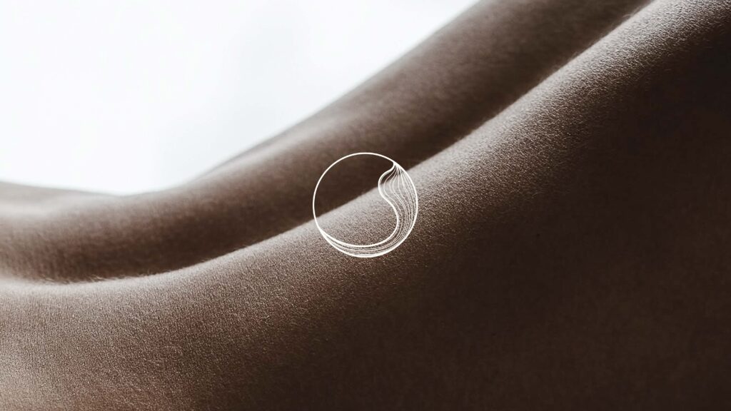
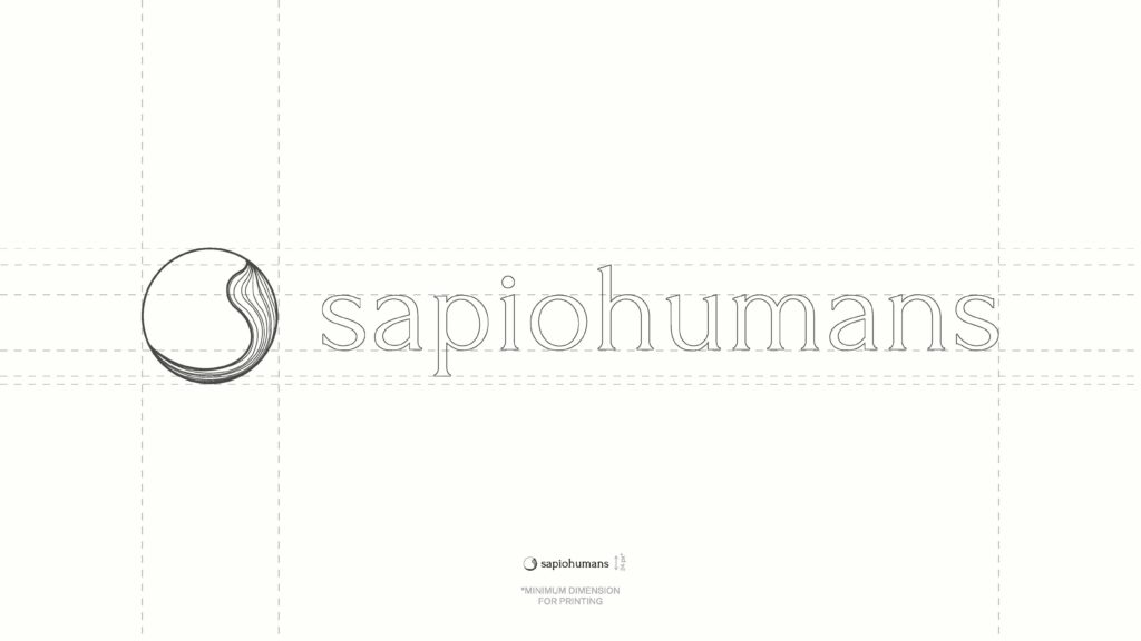
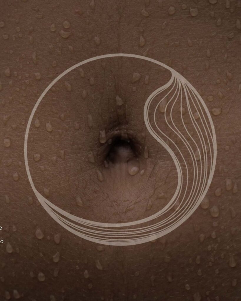
At the core of the brand lies a distinctive symbol: a refined ‘S’ enclosed in a circle, inspired by the yin-yang, representing harmony, duality, and balance. The ‘S’ flows organically, referencing the cyclical nature of the female body, with biomorphic curves symbolizing rhythm, regeneration, and life cycles.
The circle represents unity and wholeness, while the fluid ‘S’ reflects cognitive flow and biological grace, a visual metaphor for a future-oriented, evolved identity.
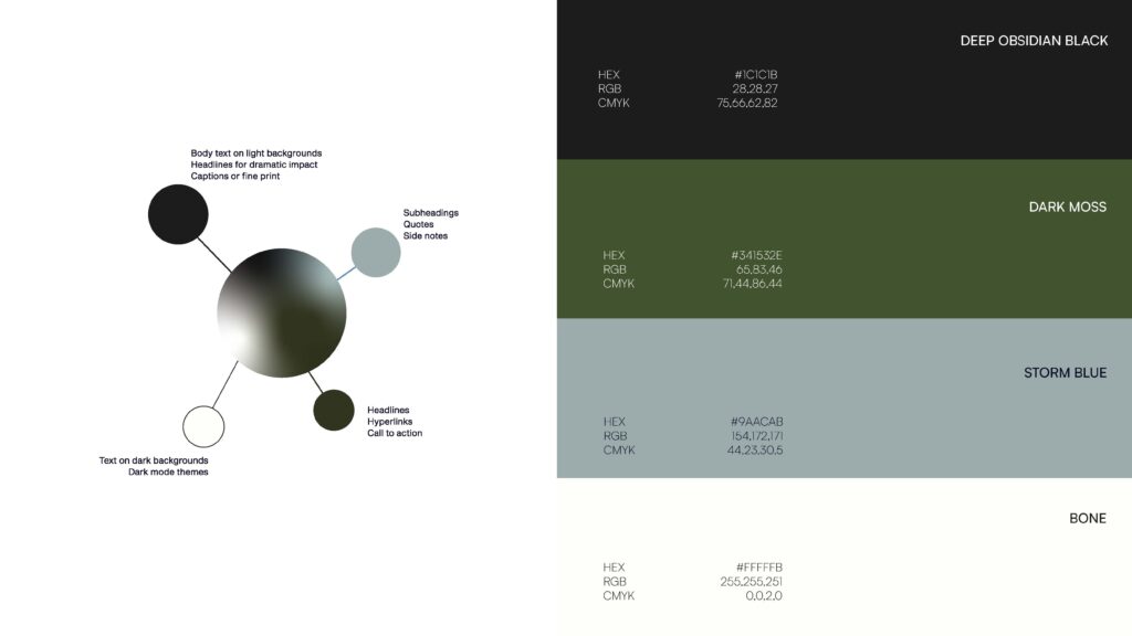
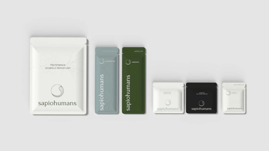
This project has a strong conceptual alignment between brand philosophy and visual design, a minimal yet expressive system that communicates evolution, intelligence, and balance, high adaptability across digital platforms, print, and product packaging and clear visual differentiation in the wellness space with a cognitive edge.
AGING ENDS WHERE EVOLUTION BEGINS
SAPIOHUMANS operates at the intersection of cognitive science, biological aesthetics, and post-human philosophy. The brand challenges traditional notions of aging, promoting the idea that “where aging ends, evolution begins.” It’s crafted for an audience that values intelligence, regeneration, and the balance between body and mind.
The objective was to create a refined, symbolically rich visual identity that captures the essence of the brand such as cognitive vitality, biological elegance, post-human aesthetics and regeneration.
The identity needed to be timeless, concept-driven, and function seamlessly across digital and physical brand touchpoints.
Rarely used raw, cork brings both innovation and cultural relevance. In Portugal, it’s more than a material, its heritage. This design honours that legacy while serving its purpose by carrying food from the earth and linking local identity to global sustainability.
CREATIVE DIRECTION
At the core of the brand lies a distinctive symbol: a refined ‘S’ enclosed in a circle, inspired by the yin-yang, representing harmony, duality, and balance. The ‘S’ flows organically, referencing the cyclical nature of the female body, with biomorphic curves symbolizing rhythm, regeneration, and life cycles.
The circle represents unity and wholeness, while the fluid ‘S’ reflects cognitive flow and biological grace, a visual metaphor for a future-oriented, evolved identity.
This project has a strong conceptual alignment between brand philosophy and visual design, a minimal yet expressive system that communicates evolution, intelligence, and balance, high adaptability across digital platforms, print, and product packaging and clear visual differentiation in the wellness space with a cognitive edge.