
MUSHIO
BRAND IDENTITY + PACKAGING SYSTEM

Mushio
brand identity and packaging system for a functional mushroom brand
Context
Mushio is a functional mushroom brand based in Tallinn, Estonia, with extracts made in Finland. A new brand, it launched with four single-species extracts, Lion’s Mane, Reishi, Chaga and Shiitake, sold online, directly to people who distrust generic wellness as much as they distrust anything that looks pharmaceutical.
Challenge
Be credible and precise about what each extract is, and at the same time feel natural and calm. Not rustic, not clinical. The supplement aisle offers two ready-made looks, the foraged and the pharmaceutical, and Mushio wanted neither. And the brand had to do all of this across a range of four that was built to grow, so the first four packs also had to settle how the fifth would be made.
Our role
The name and the logo already existed. We built the brand identity around them, colour, typography and illustration, and designed the packaging system for the four launch products: label and carton, through to production artwork. The tone we set with the founders: pure, calm and contemporary. A brand world where nature, ritual and performance coexist, instead of competing.
Three decisions:
Resolve the nature/science tension; don’t pick a side.
Each element has one job. Data and structure carry the science: the information hierarchy, the facts about each extract, the grid of the label. Colour, illustration and rhythm carry nature. Nothing on the pack reads as a concession to the other half.
One rule for the whole range.
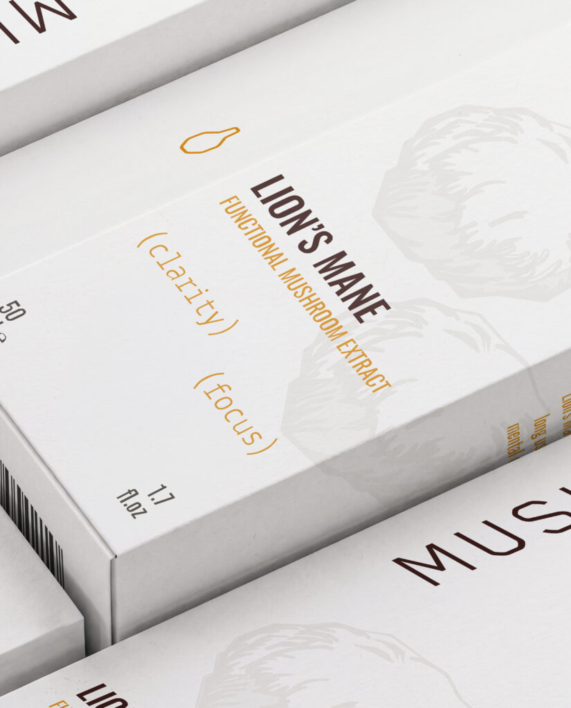
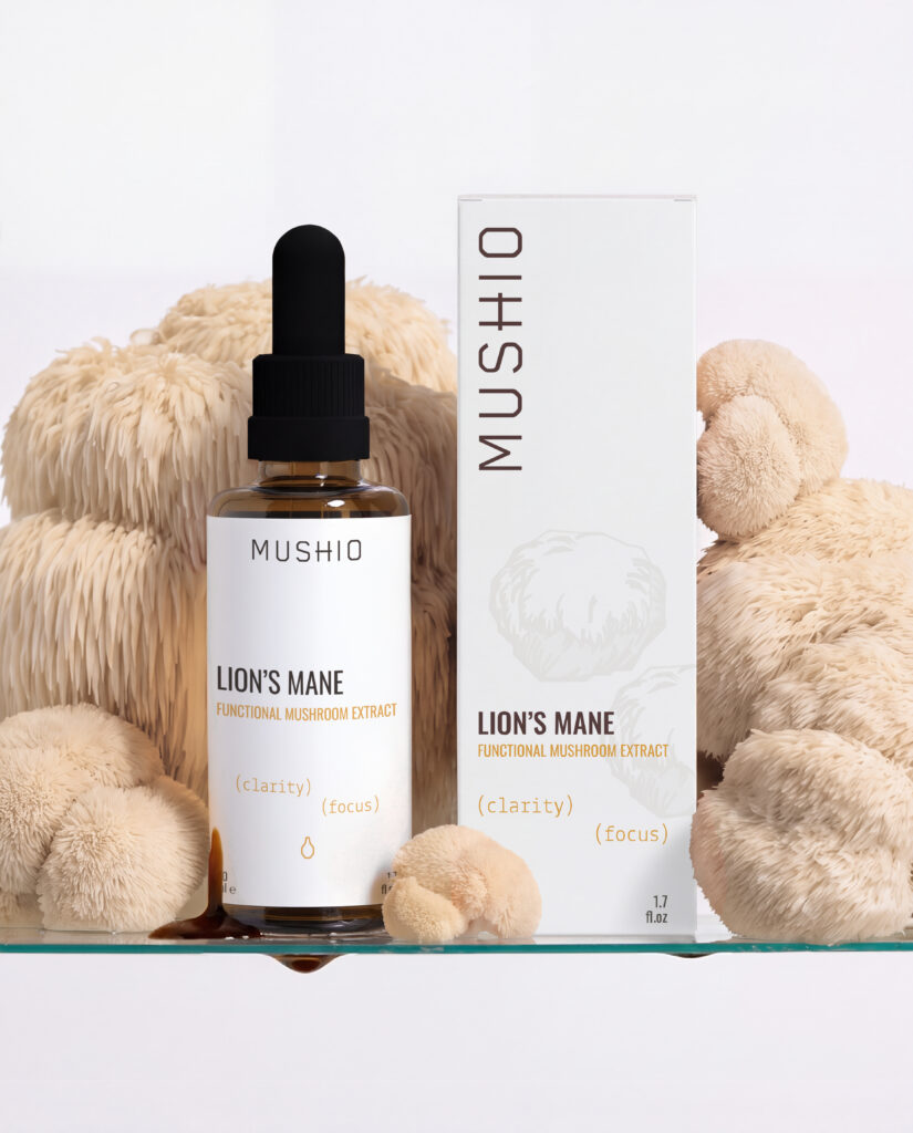
Three things change from one product to the next: the mushroom, its illustration and its colour. Everything else, label structure, typography, logo position, information hierarchy, carton construction, stays fixed. When a fifth mushroom arrives it gets its illustration and its colour, and the rest is already decided.
Carton and label, one hierarchy.
The carton does the talking on the shelf and in the unboxing: it carries the colour of each mushroom, the illustration and the name. The label on the amber bottle is deliberately quieter, white, data-led, one vertical rule, the same typography and the same order of information, so the bottle stays calm on a kitchen counter. Learn the hierarchy once on the carton and you can read it on the label without thinking.
Deliverables
Brand identity on the existing name and logo, colour palette, typography, illustration system, Packaging system for four SKUs: label and carton, Production artwork, Mockups
Result
Mushio launched and the four extracts are on sale at the brand’s own shop. The range reads as one brand at a distance and as four distinct products up close, and the rule that makes that happen lives in the system itself, so the next extract starts from the four that exist rather than from a blank page.



“everything was perfect from start to finish. They brought creativity, professionalism, and great attention to detail, and together we managed to create amazing packaging that truly elevates the brand. I highly recommend MTYS and would be happy to collaborate again in the future!”
Founder, Mushio
